Album Cover
(My cover)


(Editors - The Back Room)


Back Cover
• I decided to go for a simplistic approach for the back album cover, similar to that used by Editors on their back album cover. This focuses all attention to the song titles and emphasises mystery, alongside simplicity which can appear all the more intiguing to the audience.
• I also placed a barcode onto the back of the CD and a record logo of a well known music company in order to make it look professional, similarly to that of a real media product.
• Furthermore, I added website details, similarly to that of Editors' album. This is a technique used on all back covers, I have noticed, as audiences are able to gain further knowledge about the artist at their own leisure.
Front Cover
- Elbow - The Seldom Seen Kid


• I noticed after producing my digipak that Elbow had also used the design of a rubix cube on the front album cover. I discovered this as part of my audience feedback from a friend. The styles in which the rubix design has been used differ dramatically which both uses and challenges this form of real media product.
- Pink Floyd - Dark Side of The Moon


• I also noticed that the colour technique used on this album are quite similar to those used on mine. The contrast of colour on black is extremely emphatic and eye catching which draws the audience in instantly.
Inlay
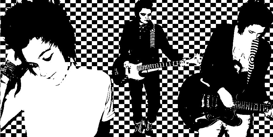
- The Specials - Best Of


• The Specials are well known for using the 'black and white check' pattern on their album artwork. It is known as a recognisable symbol of the 'Ska/punk' genre of music, however this is not the reason that I used this pattern. I used this pattern to enable the black and white threshold affected images to be complimented, whilst still standing out in an eye catching manner. This both uses and challenges conventional forms of real media products as it breaks the 'Ska/Punk' link, associated with the pattern. This may also allow me to attract audiences who like Ska music, simply because of the pattern however understandably, this could be misinterpreted and misleading.
POSTER


• The 'threshold' effect was also a technique used by The Pretenders on one of their posters that I remembered seeing at some point in the past. The technique allows the image to feel and look more 'iconic', bold and recognisable. Also, the black and white colouring on my poster enables the coloured text to stand out, which is what I feel the Pretenders' poster lacks as I feel that the main purpose of a promotional poster is to attract as many people into listening/buying the music advertised as possible.
 With this in mind, Photoshop was the main programme we used to create the print pieces. Firstly, we measured out guidelines for the CD case in photo-shop so that the panels and folds would be of an accurate and realistic size and we set up an A4 sized page for the advert.
 We had decided after our research that to get an authentic background to make the paper look worn, we would tea-stain some paper then use the stills cameras, the Nikon D60 SLR, to take original images of the paper to use as the background. Similarly we did this with the outside panels by using an old worn book to create the outside covers of a diary. We used these cameras heavily throughout the construction stages as we again decided to give our print artefacts an original and unique touch by hand-drawing all the text, taking pictures of it all then using the Magic Wand tool on Photoshop to cut the text out. We also used the Nikon cameras to take the image for the advert.


 On the advert we also followed some conventions of music magazine adverts that we had researched - for example we included an image of the album cover, and also displayed the release date of the album and where it would be available to buy clear to the reader. Other conventions that were important to follow to emphasise that it was designed for a music magazine was we included the name of the magazine, the issue date and a page number in the bottom corner of the page. We felt that these small conventions were important to give our advert authenticity so that it resembles a real media product that could be seen in a magazine. We deliberately positioned our background image slightly left of centre frame, thus it remained the main focus of the advert yet provided us with a large space that needed filling. So we researched some more magazine adverts for other albums, and found that many included reviews of the album by other music magazines. We decided that this was an important convention to follow and added in two reviews.


